Chart classification with deep learning
At Gramener, charts are central to communicate data insights and story. Over the years, numerous charts have been created, designed, and implemented.
We wanted to reduce the time and effort it takes to productionize a design. Internally, we use Invision to share design prototypes after design is created in Sketch. One of the first steps that developers do is to review the design and see which chart implementation suits the design best. This involves visual inference and learned experience from years of creating charts.
This seemed like a good problem to solve with image classification and deep learning. The past month, Jaidev [Twitter] and I have been occupied with this problem.
Solution
Upon submitting a valid chart image [1], the model classifies it into one of the five charts (bar chart, donut chart, map, multiline chart, scatter plot). It doesn’t yet have enough learning to be able to classify subcategories of a chart type (ex: stacked bar chart or choropleth). Once we have enough training data it should be able to learn so.
Once a classification label is determined we link it to the implementations from Gramex Charts. This can be data library agnostic.
Prototype
We picked ~50 images each for bar chart, choropleth map, scatterplot, and treemap from Google Images and trained a VGG16 model. It performed well enough (>90% accuracy) for us to extend this approach for our data. Time to get real now!
Training data
The source data for us came from Invision designs (some designs are made public).
We invited volunteers to label the charts to prepare the training data. Three volunteers signed up, I joined them and labeled the charts in the next two weeks.
Labelling
Labelling the charts imported by a user was tricky business. We curated ~100 chart labels using chart naming taxonomies (Chart Picker, The Data Visualization Catalogue, Data Viz Project). We leveraged the labels we created for Gramex Charts.
Mistake 1
The labels chosen for this exercise are URL slugs from Gramex Charts which might have misinformed volunteers during labelling. Further, there was no visual cue on what the label meant which could have confused them.
Mistake 2
We allowed the users to write free form text to label the charts. It resulted in some creative labels for charts and necessitated a prolonged validation phase.
Mistake 3
Due to the custom nature of solutions Gramener creates, some charts tend to be combinations of multiple chart types (ex: bars + area in one chart). This prompted us, during the labelling phase, to also solve for the multi-label classification. This wasn’t well thought of and complicated the data to be classified as other than the actual label. Only consolation was that this could be useful as noisy data to avoid overfitting.
Validation
Here, for all the labelled images I validated the labels and corrected them. This took me a few days.
Training
We picked VGG16 model using Keras which is pre-trained on ImageNet dataset.
Training the model as is on the entire set resulted in poor accuracy (~30%). Then we filtered charts that had at least 20 samples which resulted in five charts mentioned above [2]. These are used in the dense layer.
Model interpretation
Bars and maps are learnt better than the rest possibly due to their representation in the training set.
Below donut chart is interpreted as a bar chart possibly due to the background diagonal bands.
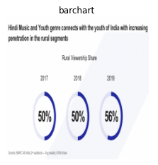
Below donut chart is interpreted as a bar chart possibly due to the blocky nature of the legend labels.
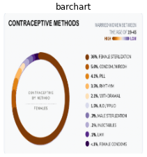
Some charts with heavy text are interpreted as bar charts. We’ll increase the training data and document our learnings in the future.
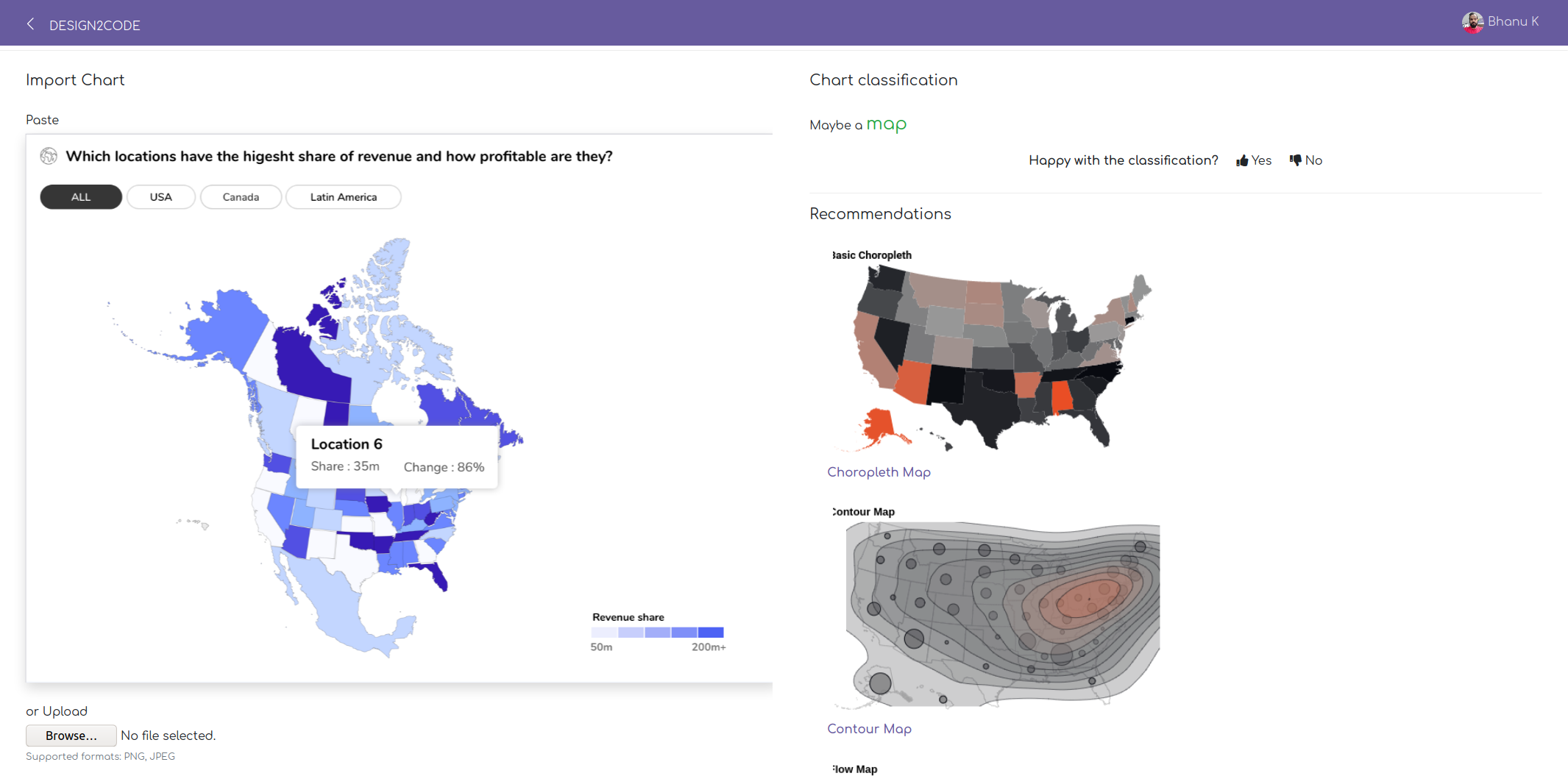
Design2Code
Currently the model is deployed for internal use. Below is the demo of the deployed product:
In the coming week, we will release a model for public use trained on publicly accessible data.
What next?
-
Copy-pasting images involves looking up images in other products or services. An improved utility would be to import a URL, segment areas of interest for potential charts, draw bounding boxes and let users annotate. We are working on this now.
-
Mixing taxonomies (ex: population pyramid and stacked bar chart practically bar charts) are useful for humans but not sufficient for model training due to relatively less sample size of such charts. For the next model iteration, we are re-labelling some of the related charts. For instance, column chart, bar chart, stacked bar chart, group bar chart are all bar charts.
-
Each chart has set of attributes such as axes, marks, visual encoding etc. These are referred to as the grammar of graphics. Extracting these would give a real ability to generate charts using a descriptive library like Vega.
-
Charts are one of the components in our data solutions. It’ll be interesting to try this approach for other components (navigation, filters, cards etc.).
-
There are other promising approaches that go from design to code including uizard, Screenshot to code, Microsoft’s Sketch2Code, Airbnb’s Sketch2Code.
We have open sourced [GitHub] the code to train the model. Hope you find it useful! Write to us (Bhanu, Jaidev) on ideas or suggestions to take this further.
Notes
- Valid chart image - For best results, an image should have one chart and not more than that. We get it, real world is a bit more complicated than that.
- Training on charts with more than 10 instances resulted in a less accurate model.