Data art
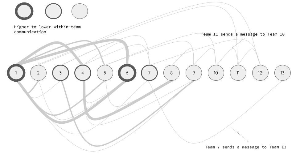
Team communication
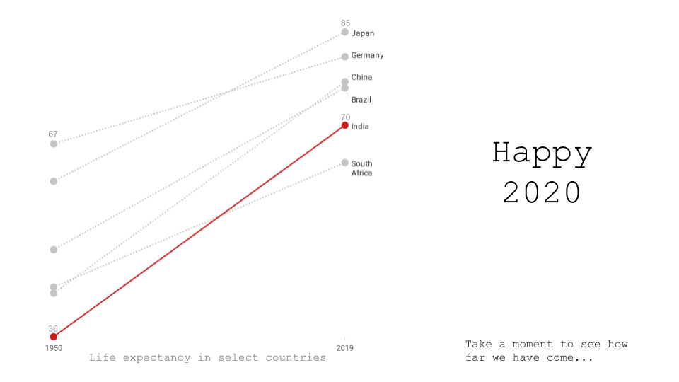
Life expectancy of countries
Our world in data is a great initiative to show world’s progress.
I curated a specific indicator for some countries with a focus on India.
Warming stripes
Show your stripes is an excellent way to introduce climate change topic.
Below is a warming stripe for India for the years 1901 to 2018.

- Each year is represented as a vertical stripe.
- Leftmost stripe represents 1901 year while the rightmost strike represents 2018 year.
- Color of a stripe represents the average temperate for a specific year.
Note
I work with data all the time. I believe that a well made data visualization that conveys a point immediately is good art. While there are variations of what art means to people my work will focus on art created out of data.