Joyful data
Joyful Data is a creative tool for making data-driven graphics.
When Priti first shared it with me I couldn’t figure out head or tail of it except that it would be a good way to create data art.
I revisited it after two weeks and realized it was the syntax that was unusual for me.
Two days ago I revisited it again with a better clarity and wanted to play with Indian political data. I created a simple dataset as follows (single item from the JSON object):
// source: https://gist.githubusercontent.com/bkamapantula/0c5dfdfdbee43ea3f2c3a3a29ad5e6a8/raw/407c77118f3d8f468fd671d7bf3de95d61c05aa6/india-legislative-assembly-seats.json
{
  "Region": "South",
  "Name": "Andhra Pradesh",
  "Seats": 175,
  "Central-Govt-Party": 0,
  "Each": 1
}
Each Indian state is a box, size is the # of legislative constituencies in a state, color is based on the party in the central government matches that of the party in the state government.
This created interesting art! All from a JSON file, that’s pretty neat.
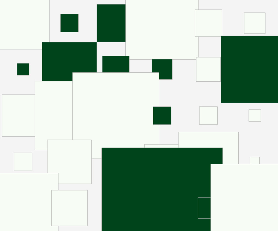 Source: https://tinyurl.com/jd-states
It can take some time to figure out the order of instructions to draw a shape.
Joyful Data can be a great way:
- to create small multiple visuals that convey insights
- to create data art/cards*
- to incrementally teach data visualization properties
* I’m interested in giving away data art to people and few additional options in Joyful Data will be useful:
- option to add title
- export to
SVG - custom dimensions
- view all created visuals like d3 Gallery
Recipes
I created Joyful Data Recipes as a way to collect recipes for data art. Submit yours!