Data storytelling with maps
Story Labs at Gramener is working on a Data Storytelling Framework. In total, there are nine explanation structures and eight sequences. One of the formats is narration through Map Stories.
Since maps fascinate me, I’m interested to tryout few example datasets and try to narrate few important aspects from them. Consider the Obesity Rate (%) in Virginia state counties across the years 2019 and 2020.
I was curious to know the Obesity Rate in the county I stayed for over four years and realized that the rate of change (difference) from 2019 to 2020 isn’t high (+0.8%). Although, in raw numbers it could still be high. That prompted me to look for the counties that witnessed high rate of change (on this, more towards the end).
Definitions
BMI is calculated as the ratio of weight in kilograms to the square of height in meters.
Obesity Rate is defined as the ratio of number of patients with obesity (BMI>= 30 kg/m2) to the number of patients in the survey.
Unfortunately, I couldn’t find the distribution of demographics data to know the survey numbers per year. Hence, the change in Obesity Rate is hard to explain from this data source alone.
Virginia Obesity Rates

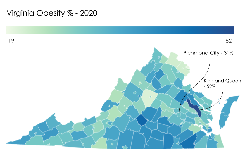
Virginia Obesity Rate 2019. Each county is colored using its Obesity Rate in 2019.
Virginia Obesity Rate 2020. Each county is colored using its Obesity Rate in 2020.
Juxtaposing
Knightlab’s Juxtapose allows us to create juxtapositions easily and lets users swipe to notice the difference. This is an intuitive format that works well at the lowest granular level.
Below is a representation of the same images from above. It follows the Then vs Now explanation structure and Swipe sequence format (E4S7) as described by Story Labs.
Swipe the slider to right or left to view 2019 or 2020 map.
The images are hand crafted. Here, only two regions are annotated.
The intention here is not to automate the image creation but to discover possibilities in bringing out details well.
Arguably, each static image could be an interactive. Hovering on each county could get respective values but it supersedes the original intention of juxtaposing regions for immediate comparison.
Scale drift
Scale changes from 2019 to 2020 owing to the changes in minimum and maximum Obesity Rate values. Comparing these values by juxtaposing next to one another is tricky since underlying color is no longer the same. Further, human vision can’t pick subtle color change that’s mapped to data, easily.
An alternative approach is mapping relative change and using a single visual.
Relative change
Mapping relative Obesity Rate of change reveals the necessary information and is crucial to drive home the point on the extreme performing counties. Below table shows a subset of data rows (note that the rate values are rounded off for 2019, 2020 columns):
| State | County | Obesity Rate 2019 | Obesity Rate 2020 | difference |
|---|---|---|---|---|
| Virginia | Falls Church City | 28 | 20 | -8.7 |
| Virginia | Surry | 34 | 26 | -7.7 |
| Virginia | Lexington City | 27 | 19 | -7.7 |
In the below illustration, we use the difference column from the data table to color the county.

Change in Obesity Rate from 2019 to 2020 in Virginia counties.
Interactive
Interactive version of the earlier illustration is below.
I picked a color scale that highlights the extremes well. This illustration will be useful for policy makers, researchers to understand the underlying changes better. A regular user (ex: a citizen) may be more interested in understanding their neighborhood and may prefer a different representation.
I’ll be exploring other Data Storytelling Structure and Sequence formats using different datasets soon.
Notes
- Data is sourced from the County Health Rankings Project.
- Images are created using Datawrapper, Google Drawings.